Chap.3 Bootstrap4[기초] - Bootstrap4, Grid System, Text, Typography, 테이블, 이미지
Bootstrap4[기초]
Bootstrap4, Grid System, Text, Typography, 테이블, 이미지
Bootstrap4
- CDN
<!-- Latest compiled and minified CSS -->
<link rel="stylesheet"
href="https://maxcdn.bootstrapcdn.com/bootstrap/4.4.1/css/bootstrap.min.css">

<!-- jQuery library -->
<script
src="https://ajax.googleapis.com/ajax/libs/jquery/3.4.1/jquery.min.js">
</script>

<!-- Popper JS -->
<script
src="https://cdnjs.cloudflare.com/ajax/libs/popper.js/1.16.0/umd/popper.min.js"> </script>

<!-- Latest compiled JavaScript -->
<script
src="https://maxcdn.bootstrapcdn.com/bootstrap/4.4.1/js/bootstrap.min.js">
</script>
다운로드 없이 링크로
외부에 있는 CSS파일 포함.
- HTML 템플릿
<!DOCTYPE html>
<html lang="ko">
<head>
<title>Bootstrap 4 Example</title>
<meta charset="utf-8">
<meta name="viewport" content="width=device-width, initial-scale=1">
  <link rel="stylesheet"
  href="https://maxcdn.bootstrapcdn.com/bootstrap/4.4.1/css/bootstrap.min.css">
  <script src="https://ajax.googleapis.com/ajax/libs/jquery/3.4.1/jquery.min.js">
  </script>
  <script
  src="https://cdnjs.cloudflare.com/ajax/libs/popper.js/1.16.0/umd/popper.min.js">
  </script>
  <script
  src="https://maxcdn.bootstrapcdn.com/bootstrap/4.4.1/js/bootstrap.min.js">
  </script>
</head>
<body>
</body>
</html>
확장팩 Bootstrap4, Font 설치
파일 > 폴더 열기 > BT4 > ex.01.html > b4-$ 입력시 기본템플릿
- Container
- .container
▪ 반응 형 고정 너비 컨테이너를 제공 (중앙)
- .container-fluid
▪ 뷰포트의 전체 너비에 걸쳐 전체 너비 컨테이너를 제공

<div class="container">
  <h1>My First Bootstrap Page</h1>
  <p>This is some text.</p>
</div>
margin 0 auto 와 같다.
style로 색을 주어야 알 수 있음.
자동 조정된다. 반응형
<div class="container-fluid">
  <h1>My First Bootstrap Page</h1>
  <p>This is some text.</p>
</div>

<div class="container p-3 my-3 border"></div>
<div class="container p-3 my-3 bg-dark text-white"></div>
<div class="container p-3 my-3 bg-primary text-white"></div>
p : pedding
my : magin (my-auto 가능)
pr, pl, pd, pt 이용가능
- 너비 (max width)는 다른 화면 크기에서 변경

Grid System
- Grid System
- 1행 당 12개의 컬럼을 스크린 크기에 따라 재조정
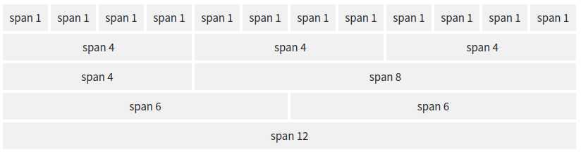
- Grid 클래스
▪ .col- (초소형 장치-화면 너비가 576px 미만) : 해상도 상관 X
▪ .col-sm- (작은 장치-화면 너비가 576px 이상)
▪ .col-md- (중형 장치-화면 너비가 768px 이상)
▪ .col-lg- (대형 기기-화면 너비가 992px 이상)
▪ .col-xl- (큰 장치-화면 너비가 1200px 이상)
- 열 너비를 제어하고 다른 장치에서 열 너비를 표시하는 방법
<div class="row">
  <div class="col-*-*"></div>
  <div class="col-*-*"></div>
</div>

<div class="row">
  <div class="col-*-*"></div>
  <div class="col-*-*"></div>
  <div class="col-*-*"></div>
</div>

<div class="row">
  <div class="col"></div>
  <div class="col"></div>
  <div class="col"></div>
</div>
- 세 개의 동일한 열
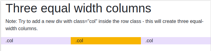
<div class="container-fluid">
  <h1>Three equal width columns</h1>
  <p>Note: Try to add a new div with class="col" inside the row class - this
will create three equal-width columns.</p>
  <div class="row">
    <div class="col" style="background-color:lavender;">.col</div>
    <div class="col" style="background-color:orange;">.col</div>
    <div class="col" style="background-color:lavender;">.col</div>
  </div>
</div>
inline style
- 반응형 열
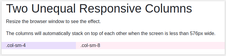
<div class="container-fluid">
  <h1>Two Unequal Responsive Columns</h1>
  <p>Resize the browser window to see the effect.</p>
  <p>The columns will automatically stack on top of each other when the screen
is less than 576px wide.</p>

  <div class="row">
    <div class="col-sm-4" style="background-color:lavender;">
      .col-sm-4</div>
    <div class="col-sm-8" style="background-color:lavenderblush;">
      .col-sm-8</div>
  </div>
</div>
숫자의 합이 12가 되어야한다.
Text, Typography
- 디폴트 설정
- font-size : 16px
- line-height : 1.5em
- font-family : "Helvetica Neue", Helvetica, Arial, sans-serif
- 모든 <p>요소
▪ margin-top: 0
▪ margin-bottom: 1rem (16px by default)
- h1~h6

- Display Headings
- .display-1, .display-2, .display-3, .display-4
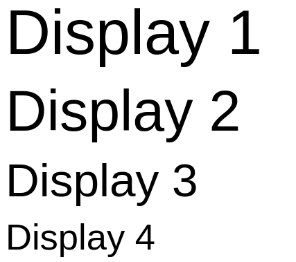
<h1 class="display-1">Display 1</h1>
<h1 class="display-2">Display 2</h1>
<h1 class="display-3">Display 3</h1>
<h1 class="display-4">Display 4</h1>
- <small>

<h1>h1 heading <small>secondary text</small></h1>
<h2>h2 heading <small>secondary text</small></h2>
<h3>h3 heading <small>secondary text</small></h3>
<h4>h4 heading <small>secondary text</small></h4>
<h5>h5 heading <small>secondary text</small></h5>
<h6>h6 heading <small>secondary text</small></h6>
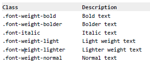
- 폰트 설정 클래스
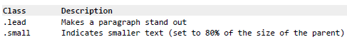
- 폰트 크기 클래스
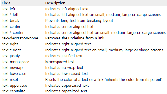
- 텍스트 정렬/설정 클래스
색상
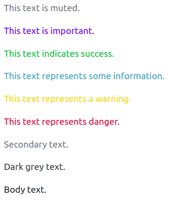
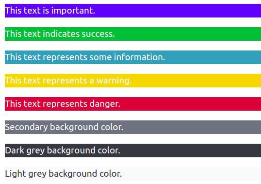
- 텍스트 색상 클래스
- .text-muted,
- .text-primary,
- .text-success,
- .text-info,
- .text-warning,
- .text-danger,
- .text-secondary,
- .text-white,
- .text-dark,
- .text-body
▪ default body color/often black
- .text-light
- 텍스트 색상 클래스
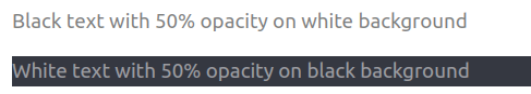
- .text-black-50
- .text-white-50
- 배경 색상 클래스
- .bg-primary
- .bg-success
- .bg-info
- .bg-warning
- .bg-danger
- .bg-secondary
- .bg-dark
- .bg-light
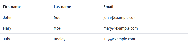
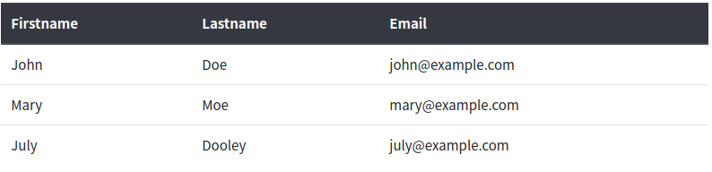
테이블
class table table-striped : tabel 필수!
- .table : default

- .table-striped : style은 th에

- .table-bordered : 선

- .table-hover : 마우스 올리면 효과 tbodt만
- .table-dark
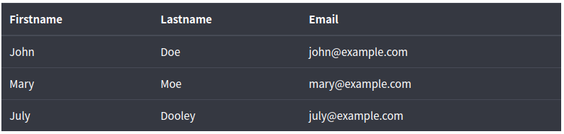
- .table-dark, .table-striped
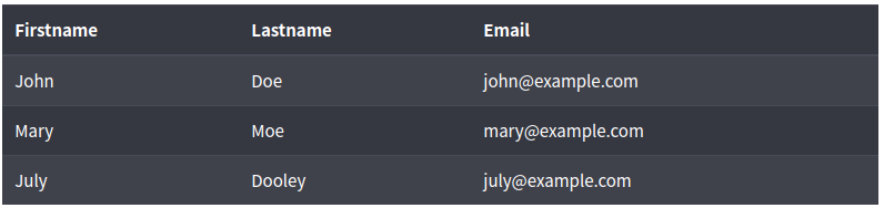
- .table-borderless : 테두리 없애기

- .table-sm : 위 아래 간격이 줄어듦

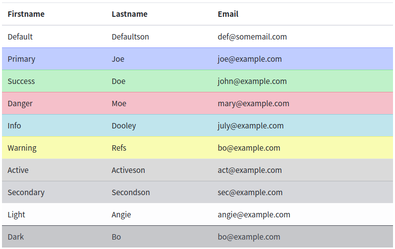
- 상황 클래스
- <tr>, <td> 에 적용
▪ .table-primary Blue
▪ .table-success Green
▪ .table-danger Red
▪ .table-info Light blue
▪ .table-warning Orange
▪ .table-active Grey
▪ .table-secondary Grey
▪ .table-light Light grey
▪ .table-dark Dark greay
- 헤더 컬러 : <thead>에 지정
- .thead-dark
- .thead-light

이미지
- .round, .rounded-circle, .img-thumbnail
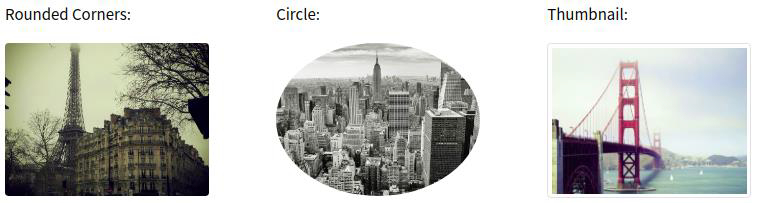
<img src="cinqueterre.jpg" class="rounded" alt="Cinque Terre">
<img src="cinqueterre.jpg" class="rounded-circle" alt="Cinque Terre">
<img src="cinqueterre.jpg" class="img-thumbnail" alt="Cinque Terre">
- .float-left, .float-rights

<img src="paris.jpg" class="float-left">
<img src="paris.jpg" class="float-right">
- .mx-auto .d-block

<img src="paris.jpg" class="mx-auto d-block">d-inline도 있다.
- .img-fluid
- max-width: 100%; height: auto;
<img class="img-fluid" src="img_chania.jpg" alt="Chania">row 이후 col-sm-6 등으로 반응형 사용 가능


댓글